Crafting a great registration website is an art and science, and we have lots to share to make the task easy for you. But one of the best ways to learn what works (and what doesn’t) is to take a look at some best-in-class event registration websites.
Your registration website is a key part of ensuring a great turnout for your event. If people find it difficult to register, your event attendance will suffer. So, it’s important to nail down.
Here are some examples of well-designed event registration websites to use as inspiration on your next event:
Making Sense of an Overwhelming Schedule: South by Southwest 2022
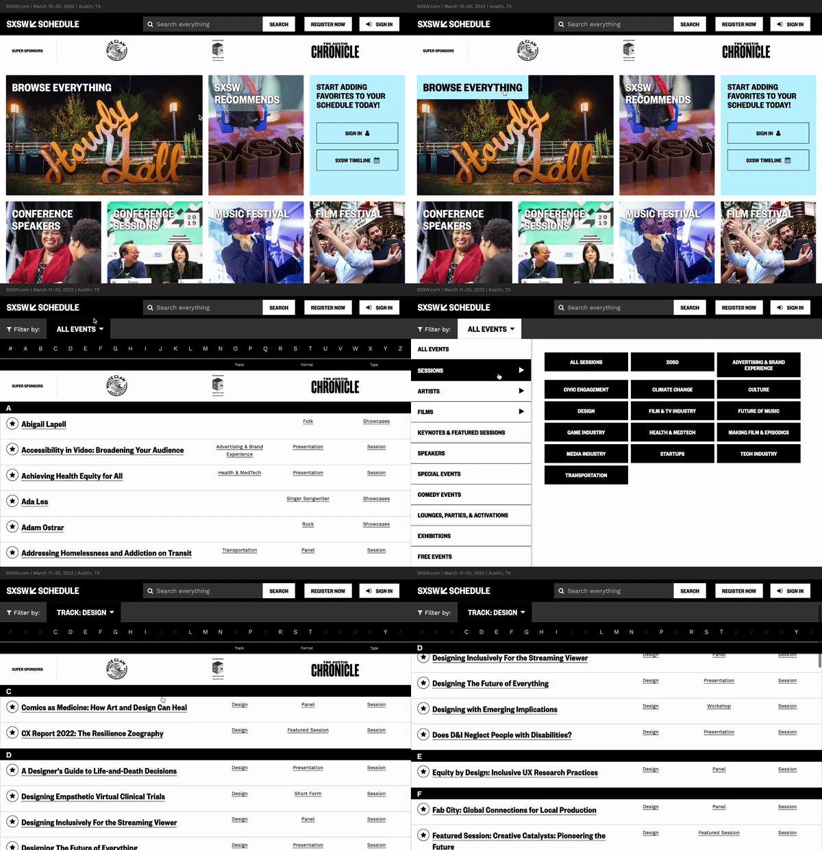
One event with a conference, music festival AND film festival makes for an overwhelming amount of sessions for attendees to choose from. SXSW tackles it on their well-organized event page.
Registered attendees can also access personalized event recommendations – the more events that are favorited, the better the recommendations become.
Users can also “Browse Everything” with the option to filter by session, arts, speakers, featured sessions, session tags, and a lot more.
💡 Pro Tip: check out SXSW’s stealthy placement of Sponsors in the upper third of the page.
Immediate Personalized Attention: Bitcoin 2022
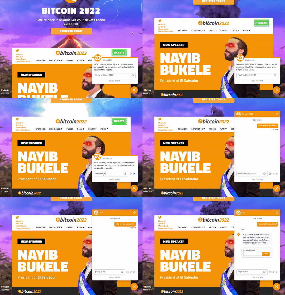
Users want (and expect) a personalized experience, and chatbots help with just that. These highly-developed search engines interact with users on the site in conversational language. They provide triage to questions: and if the chatbot is unable to find an answer that satisfies the user, it can direct the question to a live person.
For Bitcoin’s tech-savvy audience, interacting with a chatbot is a no-brainer, and it will no doubt drastically reduce inquiries for the event staff. The Bitcoin 2021 chatbot loads as soon as the page loads onto a browser, but can easily be closed if the user doesn’t want it on screen.
💡 Pro Tip: include an email capture element to your chatbot!
Simple, Yet Striking Design: Fast Company Innovation Festival 2021
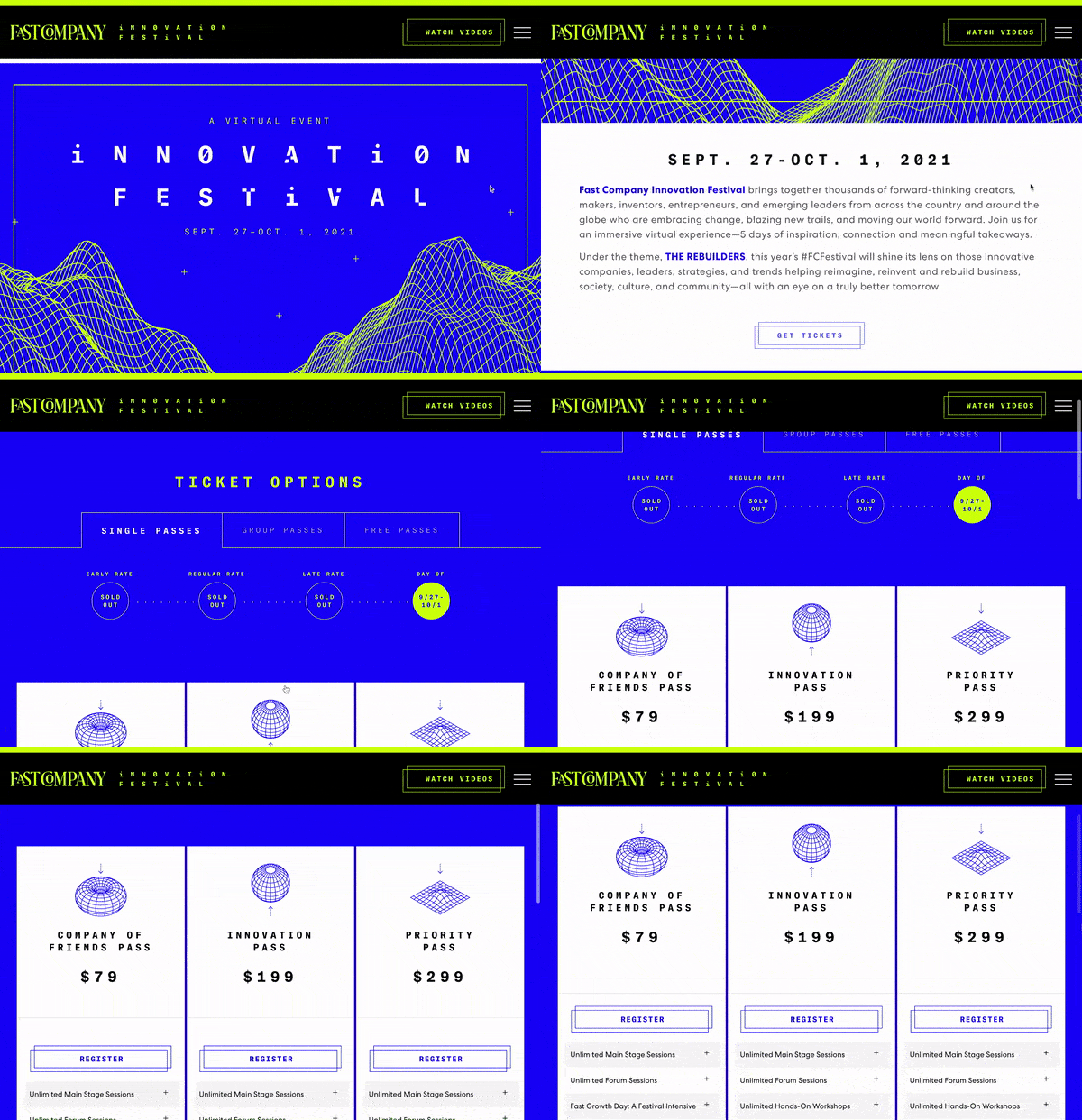
Fast Company’s annual innovation festival kept things simple yet bold this year with a minimal design aesthetic and straightforward website. The ticket options page made it easy to differentiate registration types, all while skinned in the cohesive, striking look/tone/feel.
Even though the event is over, users can easily access video content from the event with the click of a button.
Flaunting Event Benefits: Dublin Tech Summit 2022
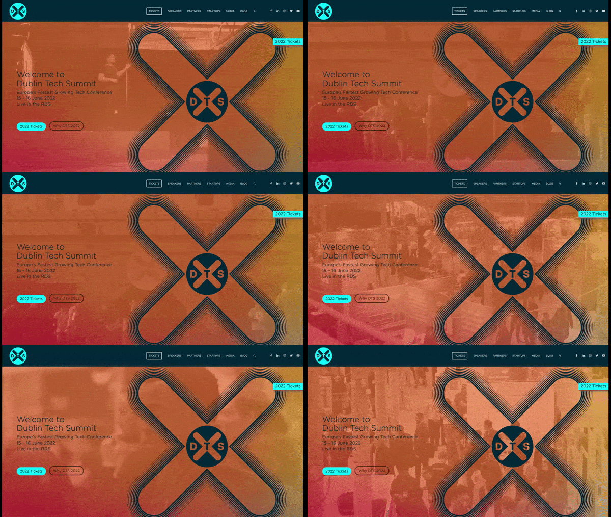
After landing on a full bleed page complete with subtly beautiful video footage, Dublin Tech Summit immediately tells the user WHY they should attend:
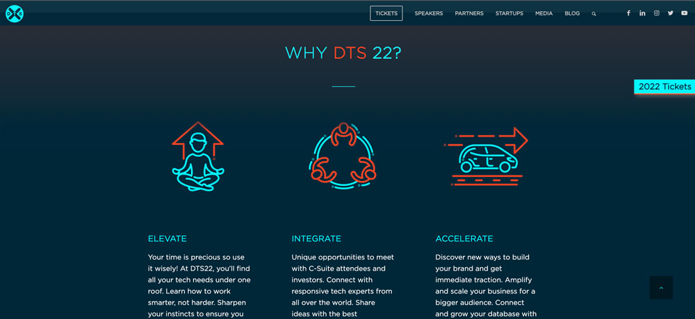
In a world saturated with tech summits, these clearly stated benefits help drive users to register. Plus, as the user scrolls the page, the “2022 TICKETS” call to action never disappears.
Showcasing Event Highlights: HD Expo & Conference 2021
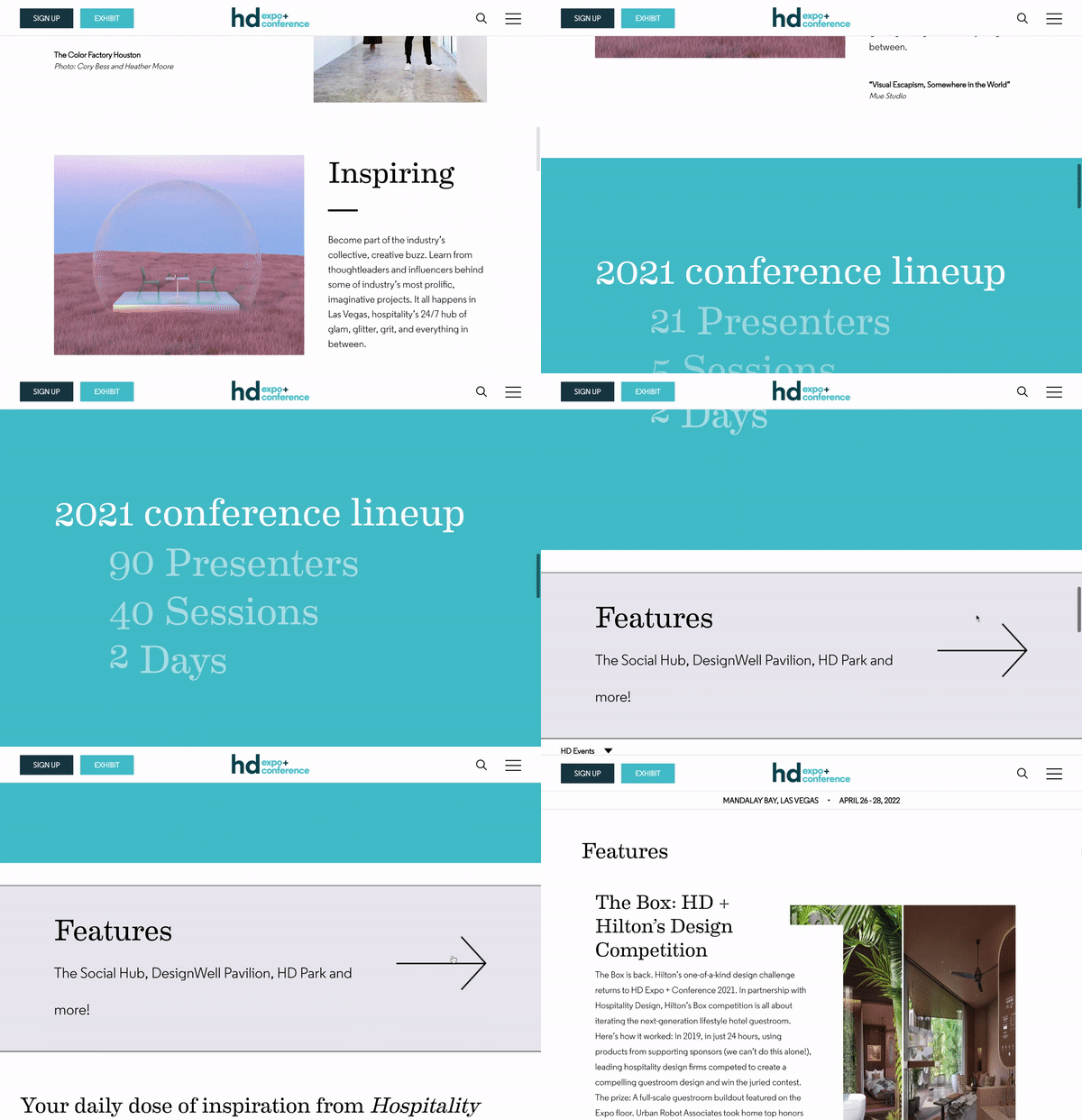
With a modern, sleek design aesthetic, site visitors can get inspired by full bleed, environmental photography before setting foot in the expo hall.
The Features page celebrates returning and new highlights the expo offers, with a focus on awe-inspiring imagery. Included right there on the page is the booth number where attendees can find each feature.
💡 Cool Idea: Scroll to the bottom of the page to check out the $5k cash prize attendees can register for by completing a passport-style challenge at the expo.
Getting to Know Your Speakers: Product Con 2022
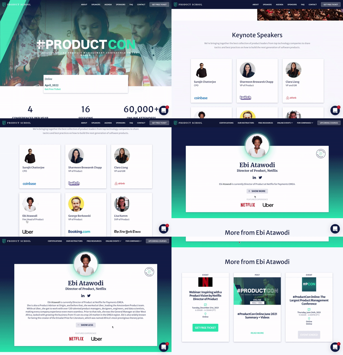
Each speaker at Product School’s annual product management conference is given their own dedicated page where users can not only read a bio, but access OTHER past and future events the speaker will be attending. What better way to get excited for a keynote? This promotional feature is likely a great way to attract speakers as well.
Setting the Bar for Video Production: Inbound 2022
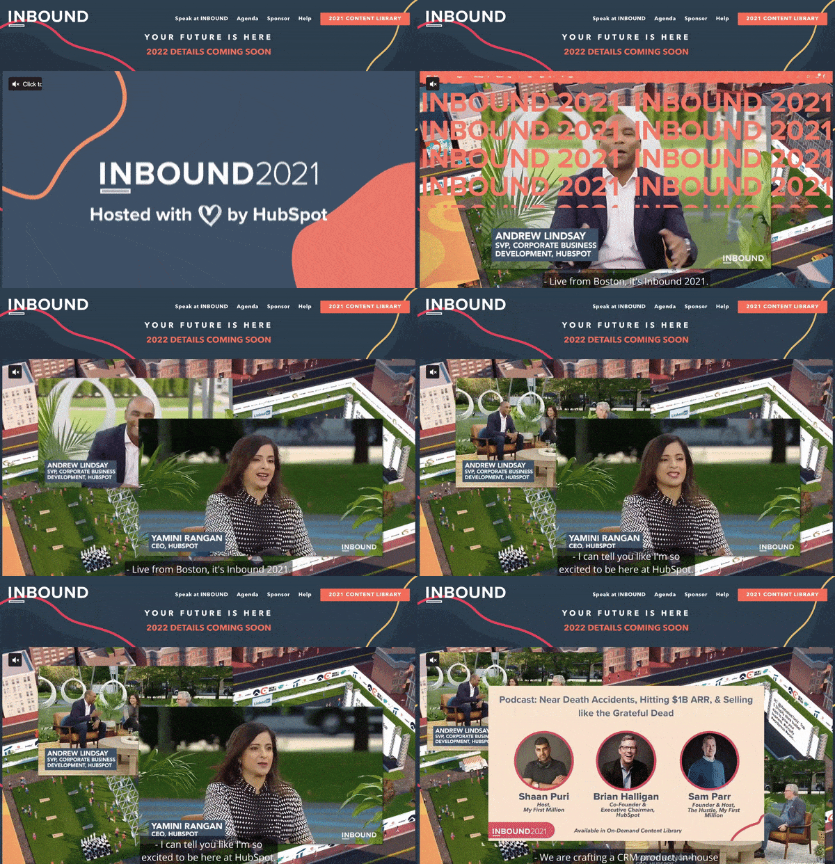
Hubspot’s fully virtual event website kicks off with a broadcast-quality video capturing and highlighting the 2021 summit. The 2 minute video not only features key content from the event, but shows off the quality of video production attendees got to enjoy. Also featured was snippets of social media chatter about the event – further driving fomo for 2022.
This event site also boasts a beautifully organized Agenda page, an easy-to-access content library, and clear call to actions for speakers and sponsors interested in partnering in 2022.


