The event’s over. The booths are packed up, the banners are coming down, and your inbox has finally stopped exploding. You’re somewhere between exhausted and euphoric, running on convention center coffee and the memory of a keynote that landed.
Then someone asks the question every organizer eventually hears: “So, how did it go?”
And someone, maybe you, answers: “I think it went really well.”
Think. That word does a lot of heavy lifting in our industry. We plan for eighteen months, negotiate every line item, and sweat details down to the font on the directional signage. Then the event ends and we summarize the whole thing with a feeling.
“It felt like a great event” is not a measurement
Nobody says this out loud, but most post-event reports are vibes with a cover page.
We say the opening keynote was packed, and it was, for the first twenty minutes. We say the breakout sessions were popular, though we’re mostly remembering the two we personally walked past. We say attendees loved the expo floor because the aisles looked busy at 10 a.m. on day one.
Here’s what those impressions tend to miss:
• The packed room that emptied halfway through, while everyone remembers the crowd at the start
• The breakout that looked full because it was in a small room, next door to a half-empty session in a ballroom
• The standing-room-only workshop that never made it into the report because nobody counted the people standing
• The VIP reception you paid a premium to cater, attended by roughly 60 percent of the people who RSVP’d
You were busy running the event, which is a different job from observing it. Anecdotes fill the gap because nothing else got collected.
The problem is that the gap is getting expensive.
Everyone else stopped accepting vibes

There was a time when “great energy, strong turnout” satisfied nearly every stakeholder. That time is gone, and you’ve probably felt it.
Sponsors used to ask whether their session went well. Now they ask how many people attended, how long they stayed, and how that compares to what they paid. When your answer is “the room seemed busy,” you’re asking them to renew on faith, and fewer of them will every year.
Leadership wants ROI, and not the hand-wavy kind. When budgets tighten, the events that survive are the ones that can show what happened, not the ones with the best stories. A CFO has never once been moved by “the hallway conversations were incredible.”
Speakers want attendance counts, partly for their own records and partly because their willingness to come back depends on whether anyone showed up. Exhibitors want to know if the traffic justified the booth. Your board wants to know if the education program is earning its keep.
And then there’s the hardest audience of all: you, six months from now, building next year’s agenda. Which tracks do you expand? Which time slots do you kill? Which session formats actually held a room? If the answer lives in your gut, you’re planning next year’s event on last year’s impressions, and impressions have a documented habit of being wrong.
The most expensive sentence in event planning might be “let’s do it again, it seemed to work.”
What changes when you actually track attendance
Event attendance tracking is the boring, unglamorous fix for all of this. When attendees badge in and out of sessions, a set of questions that used to be unanswerable becomes routine:
Which sessions were actually popular? Not which rooms looked full. Actual counts, comparable across rooms of different sizes. That small room running at 110 percent capacity and that ballroom at 30 percent are telling you something about next year’s room assignments, and probably about your content too.
When did people leave? A session that holds its audience for 50 minutes and a session that loses half the room by minute 20 can look identical in a photo. In/out data tells them apart, which is exactly the information you need before rebooking a speaker.
Which tracks underperformed? Maybe your emerging tech track drew crowds while your compliance track played to empty chairs, or maybe the opposite, and the fact that you can’t say for sure right now is the whole problem.
Which ticketed events had no-shows? If you’re paying per plate at a paid lunch and 40 people who bought tickets never scanned in, that’s real money, and it’s also a signal about how you’re scheduling and promoting those add-ons.
Which sponsors got real engagement? This is the one that changes renewal conversations. Instead of telling a sponsor their workshop seemed busy, you can show exactly how many attendees checked in, how long they stayed, and how that engagement compared to similar sessions. The first is a claim; the second is a renewal deck.
The other thing about session attendance data: it compounds. Two or three events in, you have benchmarks for what a healthy session looks like for your audience, which time slots are dead zones, and which formats consistently outperform. By then the report isn’t a formality. It’s the first document you open when you start building next year’s agenda.
Where A2Z Events fits in
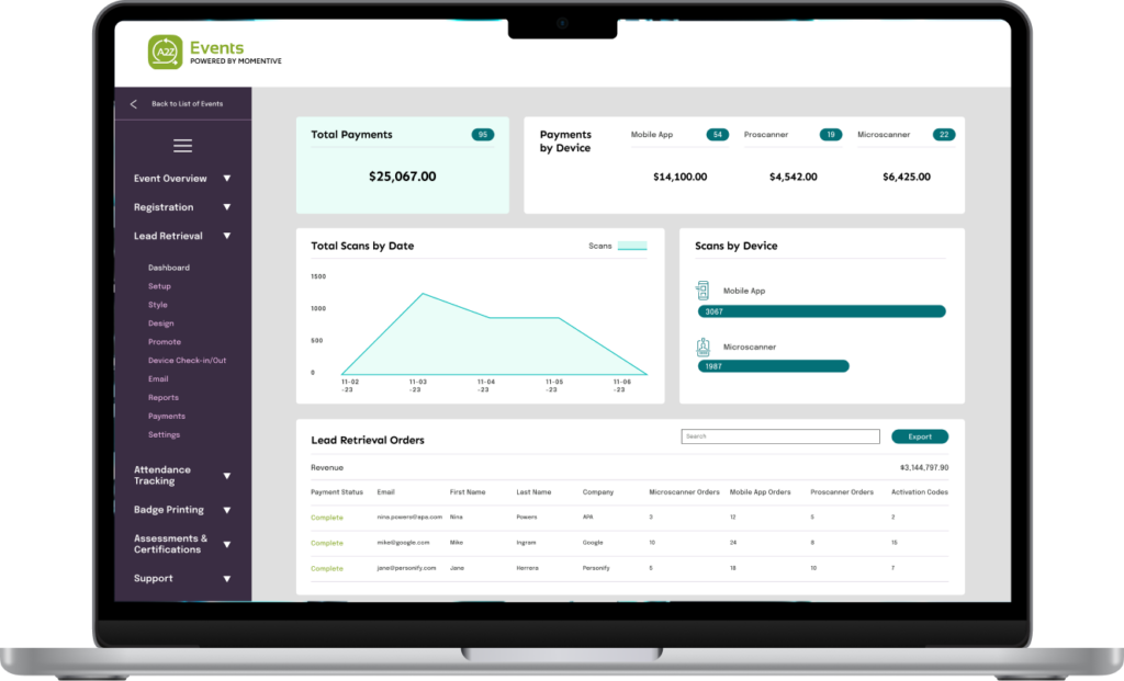
Collecting this data by hand is technically possible in the way that hand-counting a trade show floor is technically possible. Nobody does it well with clipboards. This is the problem A2Z Events, powered by Momentive Software, was built to solve. Badge scanning at session doors captures who entered and when, in real time, without slowing down the line. If a session is ticketed or restricted, the same scan validates access, so your premium workshop stays premium and your credentialed sessions stay credentialed. No more volunteers squinting at badge colors.
Because scanning captures both entry and exit, you get true in/out attendance rather than a single count at the door. And because the reporting is built in, the numbers show up as usable reports rather than a spreadsheet project you’ll get to eventually. Session comparisons, engagement trends across days and tracks, and sponsor-ready summaries come out of the system instead of out of your weekend.
It works for conferences, trade shows, and corporate events, and thousands of organizations use it, from associations to major industry conferences. The scale matters less than what it implies: this approach to conference analytics is becoming the norm, not the edge case.
The data gets better when the pieces connect
Attendance tracking on its own answers a lot. Connected to the rest of your event stack, it answers more.
When registration, badge printing, and check-in run on the same platform, your attendance data links back to who people actually are, their member type, their industry, and their registration package. A session that drew 200 people becomes a session that drew your first-time attendees, or your C-suite segment, or exactly the audience a sponsor was promised.
Layer in lead retrieval and sponsorship management, and sponsor ROI becomes a report you generate rather than a case you argue. Add attendee engagement and matchmaking tools or a mobile event app, and you can see how session attendance connects to the rest of the attendee journey.
The renewal conversation is where this pays off hardest. A2Z’s Event Sales Engine puts booth sales, sponsorships, contracts, and invoicing in one portal, so when your attendance report convinces a sponsor their workshop was worth it, there’s no gap between the yes and the sale. They log in, see live availability in the Sponsorship Gallery, and check out in one cart instead of waiting on a revised PDF and an invoice your team will have to chase in March. The data makes the case, and the checkout is right there when it lands.
You don’t need all of it on day one. But attendance data is the thread that ties the rest together, which is a good argument for starting there.
The question worth sitting with
Before the next planning cycle kicks off, try this: pull up last year’s post-event report and count the claims you could actually defend with data. Not impressions, not attendee quotes, not the registration total. Verifiable numbers about what people did once they were inside.
Then try one more test. List your five highest-rated sessions from the post-event survey next to your five best-attended, if you know them. When the lists don’t match, your survey is telling you who stayed happy, not what drew people in the first place, and those are two different inputs for next year’s agenda.
For most teams the honest answer to both exercises is a short list, and that’s worth knowing before you commit next year’s budget to repeating this year’s assumptions.
The best events don’t just create memorable experiences. They generate the insights that make the next event even better. If you’re ready to replace “we think it went well” with numbers you can confidently share with leadership, sponsors, and exhibitors, see how A2Z Events helps organizers turn attendance into answers. Request a demo and see what your next event report could look like.